
Blue Bottle Coffee Packaging: Lessons in a Clear Coffee Bag Hierarchy
Study a documented Blue Bottle Japan bag example, then build an original coffee front that separates your identity, coffee name and changing production information.
Blue Bottle coffee packaging offers a useful hierarchy exercise when you start with a specific documented example. The Bella Donovan bag pictured in Blue Bottle’s official Japan store places its bottle identity and brand wording above the coffee name on a restrained front. This article examines that Japan-store image, reviewed October 6, 2026; it does not describe every US or international edition. For your own bag, give brand identity, coffee identity and changing information separate jobs without copying the bottle symbol.
A coffee front needs to answer two simple questions: who made this, and which coffee is it? The harder part is keeping those answers clear when the information beneath them changes. Begin with the reading order, then make room for the details.
Document the coffee bag example
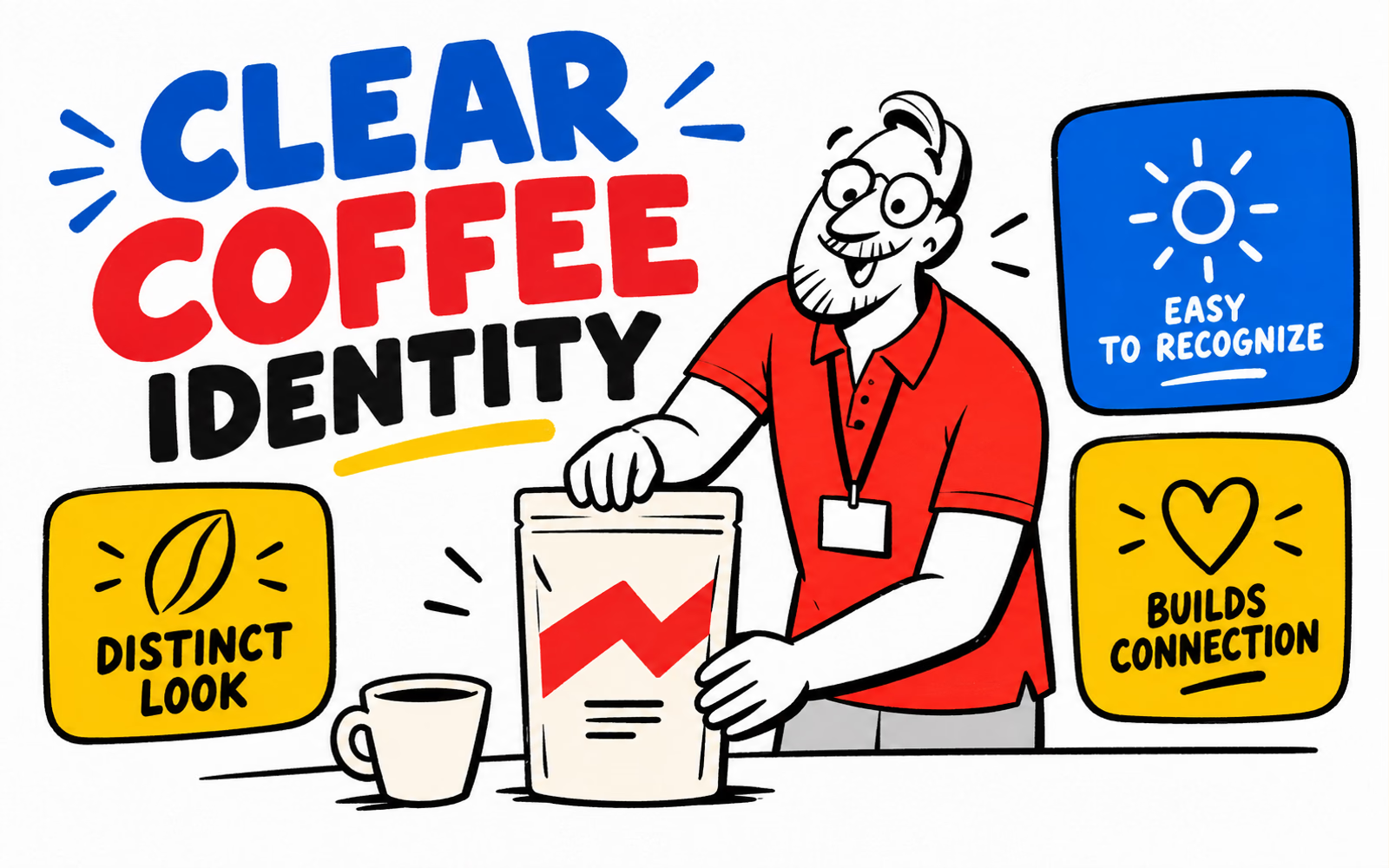
The official Japan product page supplies the specific example: a light-colored Bella Donovan pouch pictured beside a coffee cup. Its front places the blue bottle symbol above brand wording, with the coffee name lower down. That is a visual observation of the displayed photograph, not a specification for its materials or construction.
The US product page could not be fully inspected during this review. We therefore identify the regional source explicitly instead of assuming its photographed bag matches a US retail version. Product photographs can change; retain the source, region and review date when using any reference.
| Record | Documented example | Boundary |
|---|---|---|
| Source | Official Japan store, Bella Donovan | One displayed product example |
| Visible front | Brand area above coffee name | A visual hierarchy observation |
| Region and date | Japan store; October 6, 2026 review | No universal US-edition claim |
| Physical properties | Not established by the image | Separate supplier documents required |
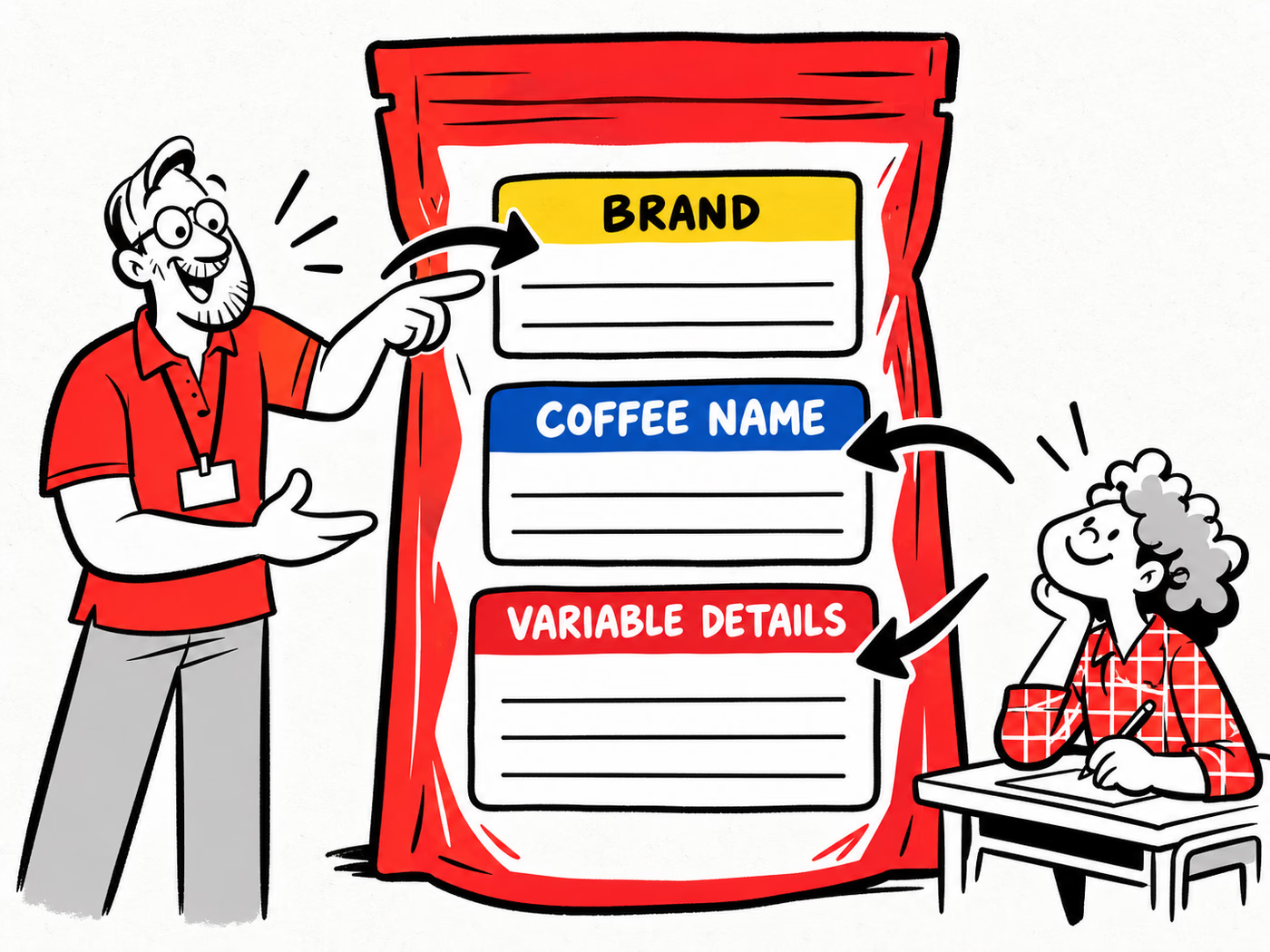
The useful design question is how the coffee name remains distinct from the maker. The proposed three-zone layout in our infographic is our own interpretation and planning tool; it is not a traced Blue Bottle template.
For wider visual exploration, see coffee bag design ideas. Here the contribution is narrower: assign a job to each front-facing field before deciding its appearance. Our search review is qualitative; no measured keyword volume or difficulty is supplied.
Separate brand, coffee identity, and variable information
Treat your identity as the part that connects the range. Treat the coffee name as the part that identifies the particular item. Treat variable details as controlled content that may change with a product reference or production run. These roles can share a palette while needing different approval processes.
List the fields before laying out the front. Some information may belong on a side or back panel, or on a separate label. The presence of a blank zone in a concept does not determine which labeling requirements apply to your actual product and market.
| Role | Working question | Approval owner |
|---|---|---|
| Brand | Which maker is this? | Brand team |
| Coffee identity | Which item am I holding? | Product team |
| Variable details | Which approved version or batch applies? | Responsible production or content owner |
In the infographic, Brand, Coffee Name and Variable Details are demonstration headings. No origin, tasting profile, certification or date is asserted for a real coffee. Replace them with approved content only after deciding what each field means.
Use the coffee information guide to build the fuller content record. Keeping information organized does not make a partial label complete, and leaving a variable area blank does not approve a coding method.
Create your own clear bag hierarchy
Start with an original mark and a recognizable identity area. Place the particular coffee name where it can be found without searching through decorative elements. Then allocate a clearly defined area for approved supporting information. A small range can use the same relationships even when names have different lengths.
Try your longest intended coffee name and your fullest approved information set early. A layout that works only with a short sample name can become crowded when a real variant arrives. Keep the same content in each comparison so a cleaner-looking version has not quietly removed useful information.
| Review item | Question | Useful correction |
|---|---|---|
| Long coffee name | Does it compete with the brand? | Adjust the space assigned to the name |
| Supporting fields | Can each field be located? | Group related content consistently |
| Graphic accent | Does it cover or interrupt information? | Move the accent around the content |
| Variant comparison | Does the same reading order hold? | Keep relationships, allow appropriate variation |
Review the filled shape
A flat file does not show every crease or panel transition of a filled pouch. Review the proposed arrangement on the relevant structure, including areas affected by seams, folds and closure. Ask the supplier which areas are printable and which should remain clear.
Our cream pouch uses a crimson abstract mark, with blue and yellow surrounding illustration. It is an independent concept. For the next step across several items, see the product-range guide; it deals with version relationships and quantities rather than this single-front hierarchy.
Prepare the packaging specification and artwork
Describe the filled coffee product, intended use, dimensions and closure needs before requesting artwork templates. Confirm the exact proposed construction with your supplier. A photograph does not establish barrier properties, valve performance, material composition or environmental attributes.
Discuss custom coffee bags and labels as proposed formats requiring project-specific confirmation. State whether identity is printed on the bag, applied as a label or divided between the two.
| Record | Provide | Confirm |
|---|---|---|
| Physical package | Filled dimensions and closure needs | Exact structure and usable panels |
| Identity artwork | Original mark and coffee-name layout | Approved file and template |
| Variable content | Fields, versions and responsible owner | Agreed application method |
| Order | Quantities by design and delivery ZIP | Quote matches the requested versions |
Use the coffee pouch specification guide for the physical brief and the artwork guide for file preparation. Review the approved content at finished size on the proposed piece, including the longest name.
Save the template, artwork version and variable-field record together. If the coffee, bag or coding method changes, revisit the affected area before repeating the order. The goal is a front that stays understandable as your own product changes.