
Kraft vs. White Packaging: Compare the Printed Result, Not Just the Base Color
Review equivalent artwork on the actual proposed surfaces. Keep construction, print process, contrast, and proof scope visible instead of choosing from color names alone.
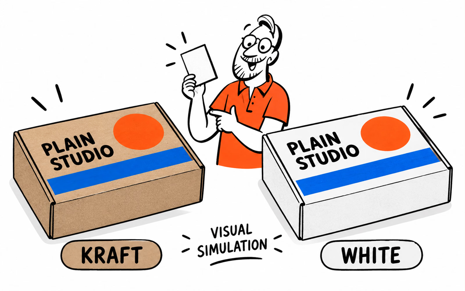
Kraft vs. white packaging should be compared with the same artwork on the actual proposed print surfaces. Define the board construction and print process first, then review contrast, small text, and color expectations. A brown appearance does not prove recycled content, and neither surface is automatically cheaper. A screen simulation can explain the concept; it cannot confirm the printed result.
A base color is part of the visual brief, but it is not the entire material specification. The useful comparison is the complete proposal that will carry your design.
Define the actual board and print process
Name the proposed structure and supplier reference. A kraft-colored corrugated box and a white folding carton differ in more than surface appearance, so they do not isolate a base-color choice. Keep the intended format and packed role equivalent where possible.
Describe what will receive the ink
Ask about the actual print-facing surface, any coating, and the proposed print method. Record whether a white area is the base itself or a separately proposed ink or layer. A white area in a digital file does not by itself specify how it will be produced.
Use the board construction comparison before assigning a material from its color. If the proposals use different constructions or finishes, write down those differences rather than presenting the result as a test of kraft against white alone.
Give both proposals the same product load, print areas, quantities by design, and intended use. Keep unconfirmed methods as questions in the brief.
Compare the same artwork on both surfaces
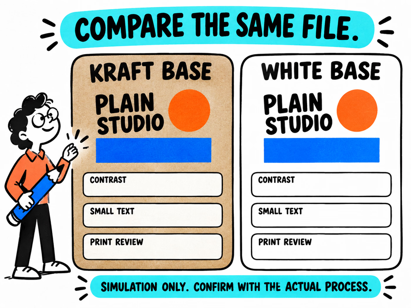
Choose one file with the same brand name, shape sizes, type, and placement. The fictional Plain Studio comparison uses black lettering, an orange circle, and a blue stripe. Its drawings are visual simulations, not samples from a printing process.
| Keep the same | Record separately | Why it matters |
|---|---|---|
| Artwork file and version | Proposed surface and finish | Avoid confusing design changes with surface changes |
| Text size and position | Actual print method | Check the proposed production result |
| Shape sizes and print area | Any proposed white ink or layer | Identify the scope of the artwork treatment |
| Viewing conditions for samples | Sample or proof reference | Keep observations tied to the item reviewed |
Compare the actual samples under the same documented viewing conditions. Take photographs as a record, while recognizing that the camera and screen can introduce another interpretation of color.
Do not adjust one design to look stronger and then call the pair an equivalent artwork comparison. If a surface needs a different version to meet the design goal, review that as a deliberate second proposal with its own file and scope.
Review contrast and color expectations
Start with the details a customer needs to read: the name, product information, and useful instructions. Review them at the final printed size. Large areas can look convincing on screen while a small line becomes hard to distinguish in a sample.
Three questions for the actual result
- Can the important text be read at its intended size?
- Are adjacent graphic areas distinguishable on the proposed surface?
- Does the reviewed sample meet the agreed visual expectation?
Keep color names separate from an approved color target or sample reference. “Bright blue” communicates a direction; it does not define a production match. Ask how color will be specified and what the proposed proof can demonstrate.
Record any required artwork adjustment instead of relying on a blanket rule that one base always produces a particular result. The illustration is a starting discussion, not evidence of ink opacity, saturation, or matching accuracy.
Request samples or proofs for the chosen construction
Request the exact material and process reference for the review sample. Ask what the sample reproduces and what remains unconfirmed. A structural sample, a digital proof, and a production-color sample can answer different questions.
Use the sample-review checklist to tie observations to the actual reference, artwork, and procedure. Record the agreed approval scope before treating a visual as a production instruction.
Compare mailer boxes, folding cartons, and paper bags as formats with their own specifications. A paper bag is a carrying format; it is not the same proposal as a box.
Use the artwork guide once the dimensions and approved layout are known. Reconcile surface, print scope, quantities, and delivery conditions in the quote rather than assuming a price advantage from the base color.
Choose the proposal whose reviewed result fits your brief. Keep the sample and artwork identifiers with the approval so a later reorder can refer to something more precise than “the brown one.”
References & planning resources
Original conceptual comparisons and worksheets support the project brief. They show no tested performance, technical grade, or confirmed supplier terms.