
Coffee Sleeve Design Ideas: Branding Around a Small Print Area
Compare typography, line-art, and color-block sleeves. Review the seam, grip, and visible artwork on the target cup before using the approved template.
Practical coffee sleeve design ideas focus on one readable message within the sleeve’s visible area. Compare a typography-led layout, a simple line illustration, and a color-block design on the actual target cup. Check the seam, normal grip, and artwork position before preparing files on the supplier’s approved template. A concept drawing does not establish universal fit or measured insulation.
The sleeve has a small working area. Its strongest design may be the one that still makes sense after it wraps around the cup and someone picks it up.
Define the sleeve’s main message
Choose what the customer should identify first: the cafe name, a recognizable symbol, or one concise introduction. Keep essential order or product information in the appropriate place within your service process.
Write for the area people can see
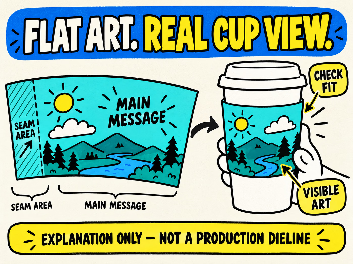
A sleeve viewed flat has more apparent space than the front visible on a held cup. Try the main message on a representative assembled sample. Check how much is covered by the hand and how the cup’s taper changes the view.
For a coffee cart, the same motif can connect cups, sleeves, and bags. See the coffee cart planning guide for that broader kit, then give the sleeve a specific job within it.
A compact design brief
- One main name, symbol, or short message.
- The exact target cup and proposed sleeve reference.
- The intended visible face and normal holding position.
- Artwork versions and quantities.
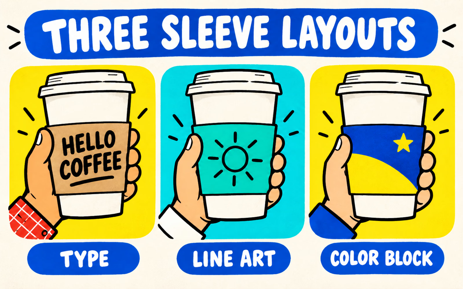
Compare three original sleeve layouts
Keep the proposed sleeve and target cup consistent while changing the graphic approach. These concepts demonstrate layout choices rather than a completed printed product.
Type first
Use a short, bold line as the visual anchor. The original “Hello Coffee” concept shows how a compact message can lead without a dense pattern. Review the actual cafe name at finished size, including longer names and line breaks.
Line illustration
Choose one simple recognizable drawing and leave it room to breathe. The illustrated sun concept uses a clear outline instead of many tiny details. Check the line weight with the proposed printing method and sleeve material.
Color block
Use a strong block or band to organize the visible face, with a small symbol or concise text. Confirm the printable areas and keep the important element away from any overlap that could hide it.
| Layout | Visual anchor | What to check |
|---|---|---|
| Typography | One short readable line | Actual name length and front visibility |
| Line illustration | One simple drawing | Confirmed line detail and clarity at finished size |
| Color block | A bold area with a compact identifier | Print coverage, overlap, and placement on the assembled sleeve |
Check seam, grip, and visible artwork
Review the flat layout and the assembled sleeve together. Identify the overlap or seam on the supplier’s actual template and decide which area should face the customer.
Try the proposed sleeve on its target cup
Check the sleeve’s position and behavior on the exact cup reference. Record the intended placement and how the complete arrangement is held. Do not assume a sleeve fits every cup with a similar menu size.
Ask someone to pick up the proposed sample in the usual way. Note what remains visible, what is covered, and whether the message wraps out of the front view. Those observations can guide the artwork placement.
Keep functional approval separate
Confirm construction and intended use with the supplier. A neat graphic does not establish measured insulation or a temperature performance result. Use the paper cup construction guide to organize the serving-system discussion.
Prepare the sleeve for the approved template
Request the template for the actual proposed sleeve. Confirm trim, overlap, bleed, safe areas, and any print constraints before placing final artwork. Use the artwork guide to prepare the file according to that approved format.
Keep a proof at finished size and review the assembled sample on the target cup. Record the artwork version, sleeve reference, cup reference, and any unresolved fit or print questions.
Evaluate cup sleeves and paper cups as one proposed serving setup. Include exact closure needs separately using the cup and lid guide.
A small area.
A clear identity.
Planning your own café packaging? Share your drink use, requested capacities, exact lid needs, quantities by design, and delivery ZIP for a custom quote.
Planning references
- BrandYourPack: Packaging Artwork Guide.
- Cup Sizes and Lid Compatibility.
- Single-Wall vs Double-Wall Paper Cups.
Reviewed October 6, 2026. Three original sleeve concepts; use the approved supplier template and evaluate the exact cup and sleeve references.