
Counter Culture Coffee Packaging: Lessons for Communicating a Coffee Range
Review documented Counter Culture blend fronts and compare two original layouts with identical content to make coffee-range information easier to find.
Counter Culture coffee packaging provides a documented example of a range communicating both identity and descriptive information. The official Hologram and Big Trouble fronts reviewed October 6, 2026 share a prominent brand area while names, colored lower areas and descriptive text differ. For an independent range, decide what the reader needs to find, then compare original layouts containing identical approved content. Clearer organization should not come from deleting information that still belongs on the package.
A colorful range catches attention, but a reader still has to identify the coffee and understand the information offered. Give those tasks space in the layout before adding another graphic or decorative line.
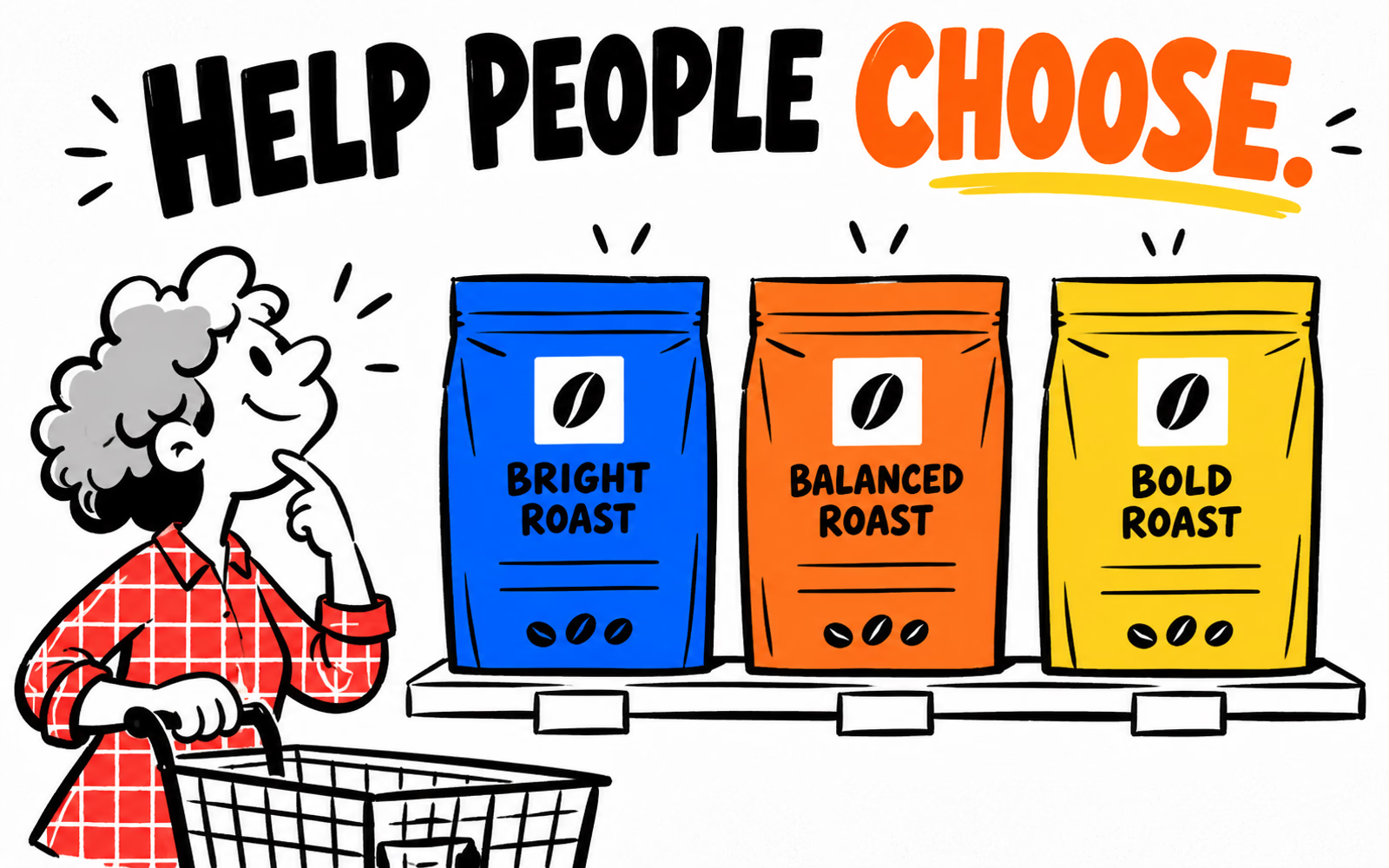
Review documented examples from the coffee range
The official Hologram and Big Trouble product pages provide front-view images and separate product descriptions. In the reviewed fronts, the brand occupies the light upper area, while the coffee name and descriptive text appear in the colored lower area. Hologram’s photographed lower area is purple; Big Trouble’s is green.
The source pages also separate roast-level information from the coffee names and descriptors. That website organization is context for our analysis, not proof that every web field appears on every bag panel. Review the actual source image before attributing a printed field to it.
| Evidence | What was reviewed | Planning interpretation |
|---|---|---|
| Front images | Two official blend fronts | Related brand area, distinct coffee identities |
| Product text | Separate names and descriptive fields | Give information a deliberate role |
| Date | October 6, 2026 | Document the reviewed version |
| Physical specification | Not established by these views | Confirm independently for your project |
We are studying a documented pair rather than combining old designs with current products. The fictional illustrations do not reproduce the brand’s names, sensory descriptions or identity. No sales or customer-preference result is inferred.
The search review is qualitative and supplies no keyword volume or difficulty. The distinct contribution here is a content-preserving readability comparison, rather than the version-and-quantity matrix in the Stumptown guide.
Separate variety information from decorative graphics
List the customer’s information tasks in plain language: identify the item, find its approved description and locate the relevant controlled field. Decide which of those tasks belongs on the front and which is better served by another panel. Keep the exact product and market requirements in the content record.
Decorative artwork can connect the range, but it should not compete with every field at once. A large graphic and a small name may look attractive in isolation while making the actual coffee harder to identify. Evaluate the relationship using the intended content and finished size.
| Element | Useful job | Review question |
|---|---|---|
| Coffee name | Identify the particular reference | Can the reader find it first when comparing items? |
| Approved description | Explain the intended information | Is it distinct from decoration? |
| Controlled field | Connect to the relevant record | Is the meaning and update owner clear? |
| Graphic treatment | Support your identity | Does it leave the content readable? |
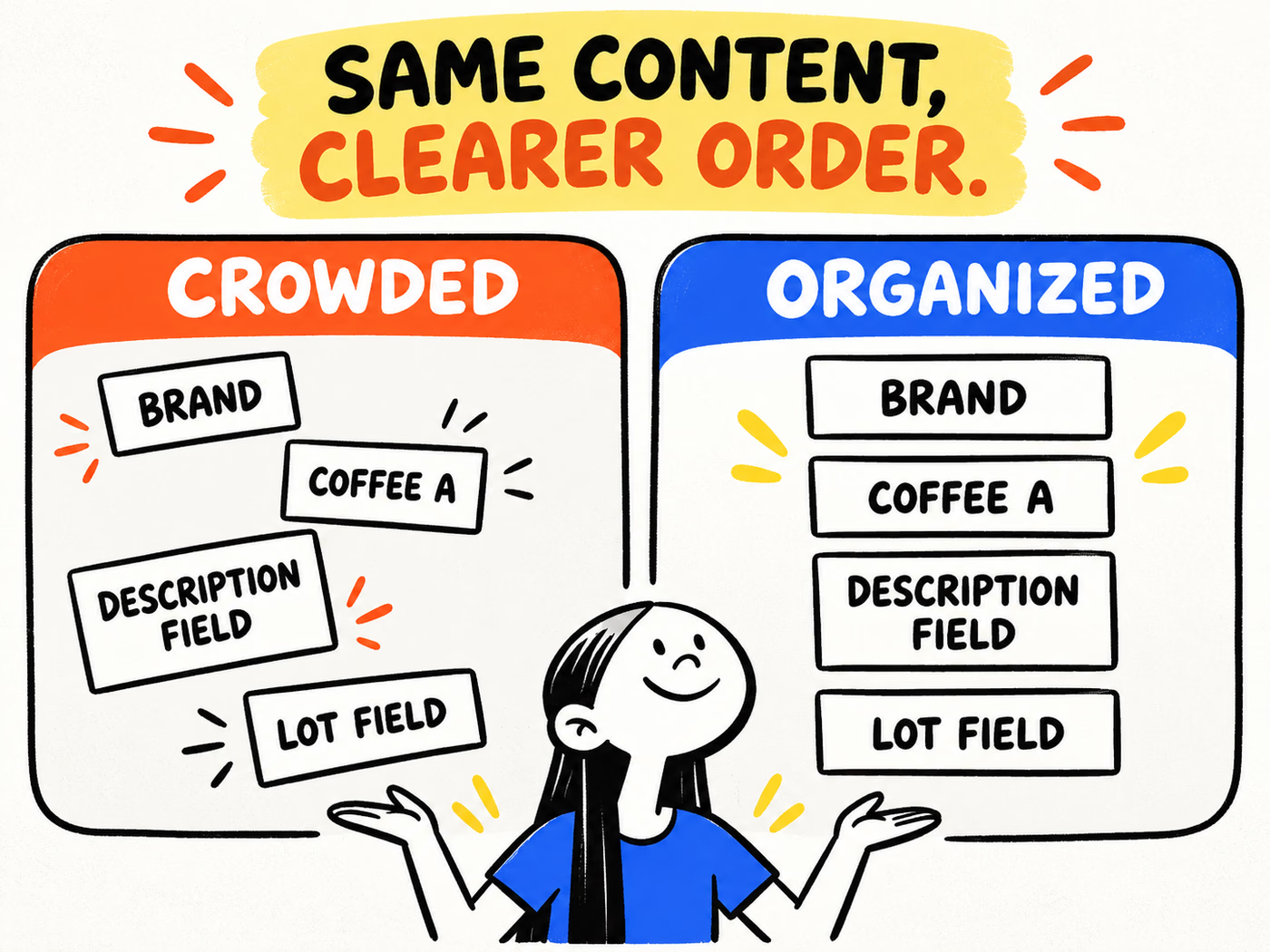
The infographic uses Brand, Coffee A, Description Field and Lot Field on both sides. These are demonstration labels, not actual tasting notes or a real batch record. The organized version changes the arrangement while retaining the same information.
Use the coffee label information guide for the fuller record. This comparison helps organize approved content; it does not determine all final labeling obligations.
Design a readable original range system
Build two alternatives with the same exact words and the same available panel size. In one, vary placement freely. In the other, establish a consistent order and group related fields. Compare the resulting reading paths before choosing a design.
Use several real references in the review, especially the longest name and fullest approved description. If the cleaner version works only after shortening important content, record that editorial decision separately. Do not present removed information as a pure layout improvement.
| Keep constant | Change deliberately | Observe |
|---|---|---|
| Exact approved words | Order and grouping | Where does the reader start? |
| Panel dimensions | Space assigned to each field | Which field becomes crowded? |
| Reference set | Consistent position relationships | Can items be compared? |
| Content completeness | Graphic placement | Is anything hidden or omitted? |
Review the actual reading task
Ask a reviewer to find the coffee reference and its approved description, then locate the controlled field. Record hesitation or confusion in the specific layout. This is a proposed review method; the illustrations do not contain completed user-test results.
Use an original identity rather than copying Counter Culture’s front division or wordmark. The front hierarchy guide helps assign field roles. Here the emphasis is whether equivalent content becomes easier to find across a range.
Confirm which information belongs on your final label
Identify the person responsible for product facts and the person responsible for final label review. A designer should not invent origin, roast descriptions, certifications or batch details to fill an attractive empty field. Tie approved copy to the exact reference.
Distinguish stable printed information from content that changes with the product or production run. Confirm the application method and usable area before placing changing fields. A mockup shows a proposed location; it does not establish a workable coding process.
| Record | Provide | Check |
|---|---|---|
| Product reference | Approved name and identity | Matches this exact item |
| Description | Approved product wording | Retained in the final layout |
| Controlled fields | Meaning, owner and method | Correct version and placement |
| Packaging request | Filled dimensions and closure needs | Confirmed proposed structure |
| Order | Quantities by design and delivery ZIP | Matches approved artwork list |
Discuss coffee bags and labels as project-specific options. Use the coffee pouch guide before finalizing the physical request, then prepare files with the artwork guide.
Save the content record alongside the selected layout. When a description or reference changes, review the resulting file at finished size again. Consistency means preserving a useful reading order, while keeping every coffee’s actual information correct.