
Rare Beauty Packaging: Brand Consistency Beyond the Product Container
Keep the carton front, information side and insert connected without giving them identical layouts. Define a shared original identity and a clear job for each touchpoint.
Rare Beauty packaging can be studied beyond the primary product container. Its official sustainability page, reviewed October 6, 2026, lists outer packaging separately from shipper boxes and components such as a welcome card and tissue. For an independent beauty brand, the useful design exercise is to connect the carton front, information panel and printed insert while giving each a different job. Visual consistency alone does not establish accessibility, material performance or suitability for your product.
A customer may recognize your identity on the carton before reading the product information or finding the insert. These are related moments, but they need different layouts. Plan the connections deliberately instead of copying the same front panel onto every piece.
Review documented packaging beyond the container
The official Rare Beauty page separates outer packaging from the shipper and names a welcome card, tissue and other inside components. That documented component list is the starting point here. We are not treating it as a complete print specification or a promise that every current order contains the same arrangement.
Our interpretation is that a packaging family can be organized by touchpoint as well as by product. The carton introduces the item, an information panel carries approved content, and an insert can help after opening. Those proposed roles belong to our original planning exercise.
| Touchpoint | Useful question | Independent project record |
|---|---|---|
| Carton front | What identifies this particular item? | Original identity and product hierarchy |
| Information side | What approved content needs space? | Exact copy and responsible reviewer |
| Insert | What useful message follows opening? | Approved destination or instructions |
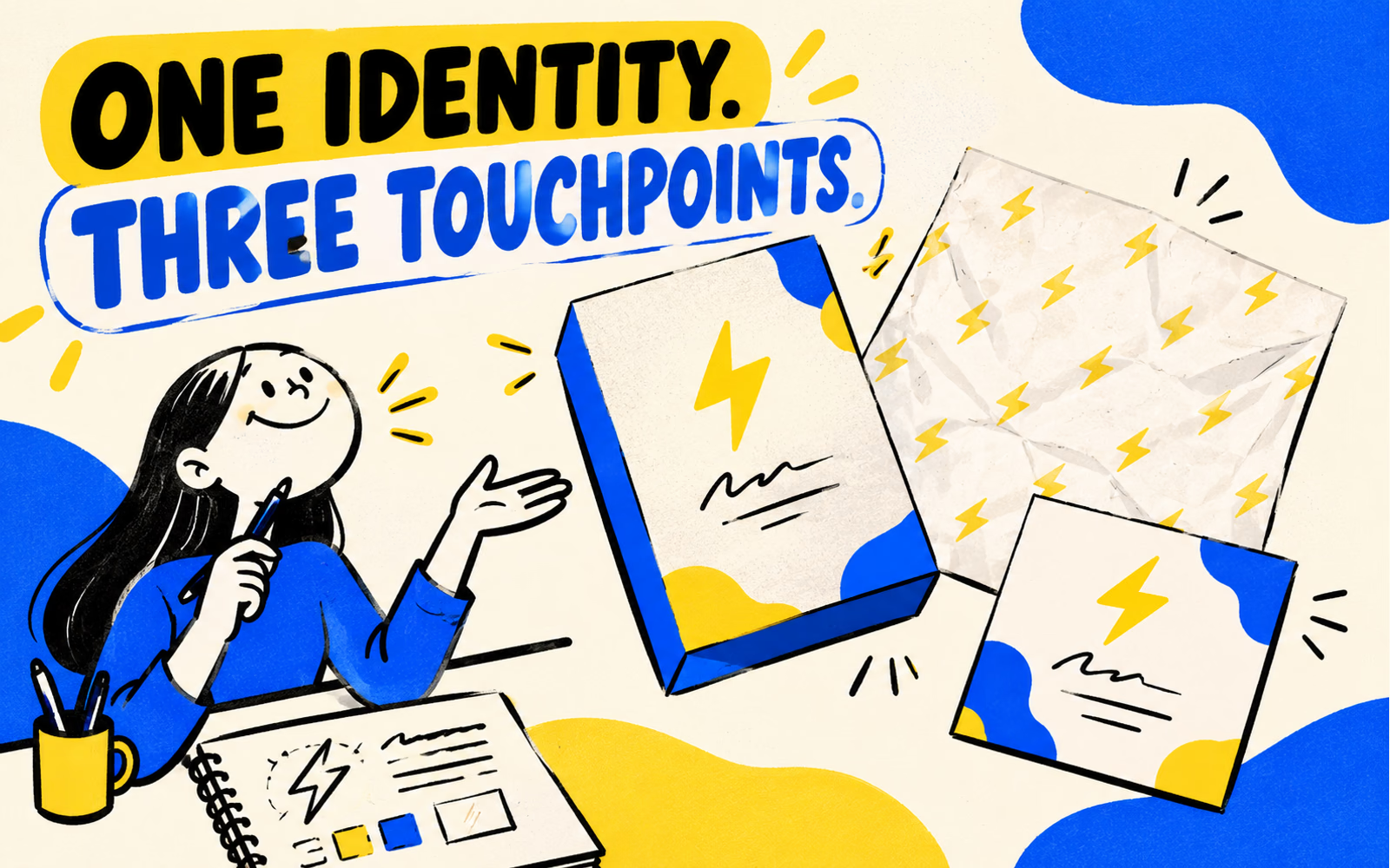
The illustrations depict a fictional blue-and-yellow system with an original lightning mark. They do not reproduce Rare Beauty’s containers, typography or packaging. The source provides a documented list of components; it does not prove the physical behavior of the proposed carton.
Our search review is qualitative, with no measured keyword volume or difficulty. For a related container-versus-carton distinction, see the Rhode guide. Here the focus is how different print touchpoints share an identity while doing separate work.
Separate visual consistency from functional claims
A repeatable symbol or color can connect a carton and card. That is a visual relationship. Whether a person can open, grip or use an actual package is a functional question requiring an appropriate review of the specific item. Neither a rounded illustration nor a large logo establishes that result.
Rare Beauty’s Made Accessible initiative page describes its partnership with the Casa Colina Research Institute and identifies use, grip and applicator-related features. Keep that initiative attached to the brand’s documented work. It does not certify a different brand’s carton or turn a similar-looking design into an accessible pack.
| Question | Relevant review | What a concept can show |
|---|---|---|
| Does the family look connected? | Compare identity and hierarchy | Proposed visual consistency |
| Is the information readable? | Review actual output and intended reader | Proposed reading order |
| How does the package function? | Evaluate the specific physical item and use | An idea for later evaluation |
Use precise wording in your own brief. “Keep the brand area recognizable” is a design instruction. “Easy to open” describes a functional outcome that needs evidence for the actual structure and users. Identify the question and reviewer rather than adding that phrase to a mockup.
Apply the same discipline to materials. Claims on another brand’s website do not establish your carton’s composition or disposal options. Obtain information for the exact proposed material and use before approving any claim on your packaging.
Build an original outer-carton system
Select one original element to connect the set: a mark, a graphic rhythm or a clearly defined identity area. Then assign the available space by purpose. The carton front needs a clear product introduction; the side needs organized approved information; the insert needs a useful message.
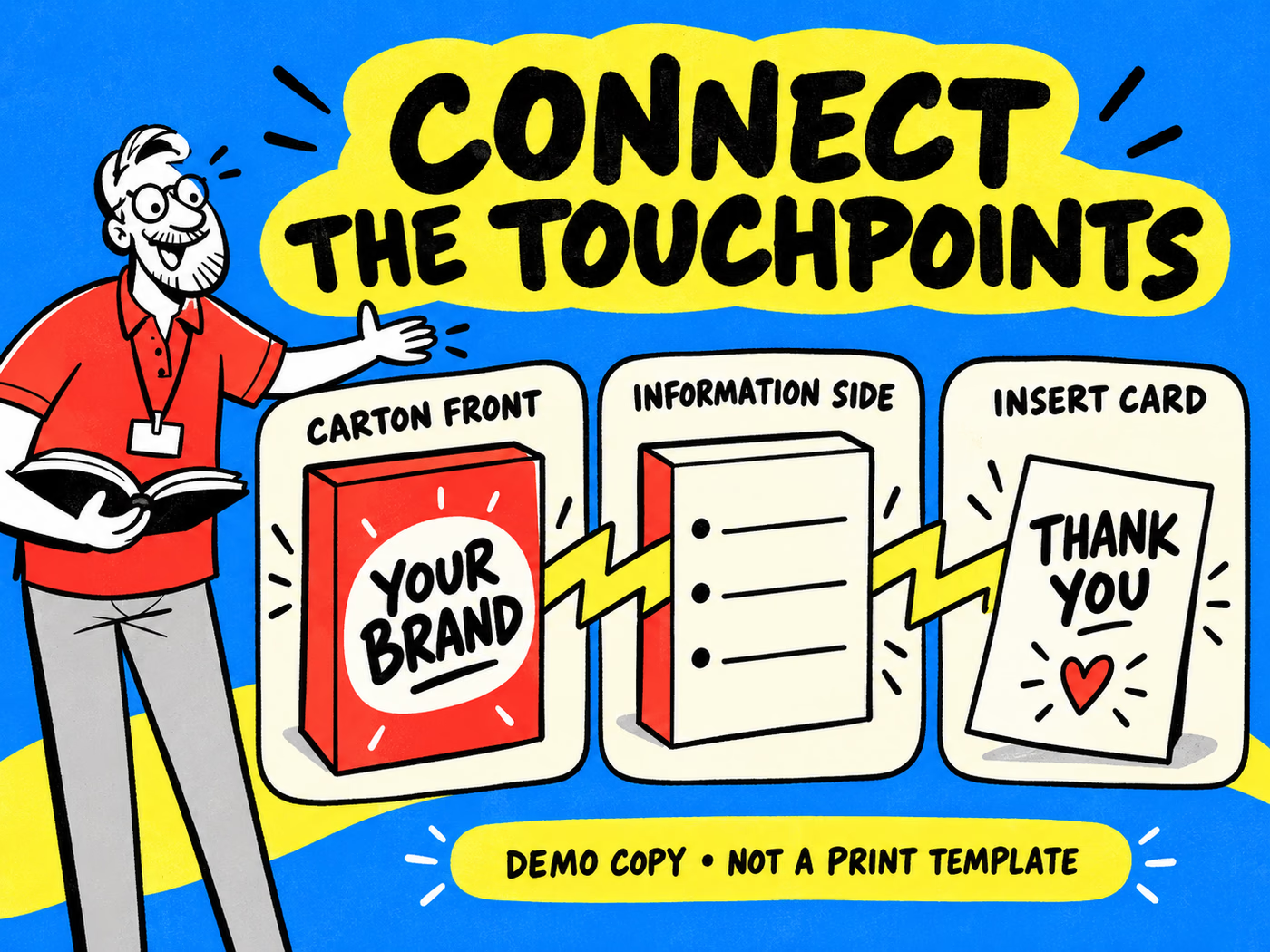
In the infographic, lightning-shaped arrows connect the three touchpoints while the text layout changes. The cover shows the separate idea of repeating an original mark across pieces. The front says Your Brand, the information panel contains blank demonstration lines, and the insert says Thank You. These are examples of different jobs, not complete cosmetic labeling.
| Piece | Shared element | Separate decision |
|---|---|---|
| Front panel | Original mark and palette | Product identification hierarchy |
| Side panel | A small identity cue | Space for approved information |
| Printed insert | Related mark or graphic | Useful message and next action |
Review the sequence as a customer sees it
Arrange the closed carton, the opened presentation and the card in order. Ask whether the customer can find the product identity first and the useful message later. Keep supporting paper from covering information that needs to remain visible in the relevant step.
Discuss folding cartons, tissue paper and insert cards as separate components. The paper’s contact role and the carton’s fit need their own confirmation. The Glossier guide helps separate presentation from transport.
Prepare a clear specification for print
Provide the complete packed product, intended use and dimensions before requesting the carton template. Include the primary container and any support that remains inside. Use the measurement guide for general measurement distinctions and confirm the convention for the exact proposed structure.
Create separate artwork records for the carton and insert, plus the paper treatment if it is printed. Give each a file name, version, quantity and approval owner. Keep the supplied product information tied to the exact item and market rather than letting a designer infer it.
| Record | What to provide | Approval question |
|---|---|---|
| Physical arrangement | Packed item and confirmed structure | Does the proposed fit match the item? |
| Carton file | Exact template and approved content | Are front and side jobs clear? |
| Insert and paper | Separate artwork and intended role | Does each piece add useful information? |
| Order | Quantities by version and delivery ZIP | Do files and quantities match? |
Use the artwork guide after the structures are confirmed. Save the exact approved files and unresolved questions with the brief. The Fenty family guide adds the separate problem of different carton proportions. A shared visual cue is useful only when every individual print item remains clearly specified.