
Rhode Packaging: A Design Breakdown for Emerging Skincare Brands
Study the documented packaging hierarchy, then define your own exterior carton system. Keep the customer-owned container, artwork and approved content as separate inputs.
Rhode packaging can be studied by separating the product container, its unit carton and the wider visual family. Its official Peptide Glazing Fluid page identifies the unit carton, cap and bottle-plus-pump as distinct components. For an emerging skincare brand, apply the hierarchy lesson to your own original exterior cartons: a clear brand area, a readable variant and space for approved product information. A carton quote does not establish container manufacturing, formula compatibility or label compliance.
A coherent skincare range starts with clear relationships between products. The practical exterior-packaging brief also needs to say exactly which container the carton will surround and which information has already been approved.
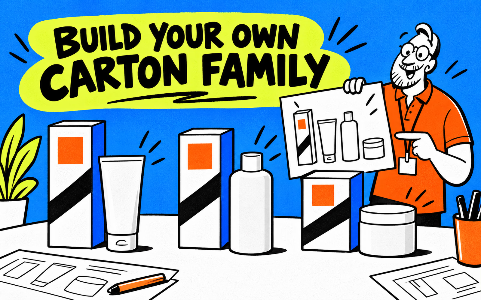
Review documented Rhode packaging examples
The official Peptide Glazing Fluid page, reviewed on October 6, 2026, shows a product container and names the unit carton, cap and bottle-plus-pump separately in its packaging information. The images give a visual example; the component list supplies a more precise boundary for the analysis.
In the reviewed product imagery, the brand and product name have distinct visual roles on a restrained container design. Our design interpretation is to establish those roles intentionally before building a carton family. That observation is not proof that minimal artwork improves sales or that it suits every skincare product.
| Documented element | Useful planning lesson | Keep separate |
|---|---|---|
| Named packaging components | Identify exactly which piece is being discussed | Another brand’s material claims |
| Brand and product-name hierarchy | Assign different visual jobs | Copying the brand or container form |
| Unit carton alongside a container | Review exterior packaging around the actual item | Formula and closure compatibility |
All illustrations here use original graphics and generic containers. They do not reproduce Rhode’s logo or distinctive product shapes. The Glossier packaging guide provides another example of why a brand’s presentation should be separated from your own actual production brief.
Distinguish containers from outer cartons
A primary container holds the skincare product. An exterior carton surrounds the already defined item and carries its approved printed information. A shipping pack groups the retail units for delivery. Name those pieces separately before requesting a quote.
Provide the actual container reference and measurements with its closure fitted. Include any retail accessories or approved support that belong inside the carton. A bottle capacity alone does not define the external shape or the carton’s internal space.
Keep approvals attached to their own scope
The brand and its qualified suppliers need to establish the primary container, closure and product-related requirements. An exterior-carton drawing or print proof does not validate those questions. Keep the approved content supplied by your responsible team separate from layout decisions.
For the exterior discussion, explore folding cartons and product boxes with actual packed dimensions. Use the measurement guide for the distinction between bare and packed items, while confirming the convention for the chosen carton structure.
Create a coherent skincare carton family
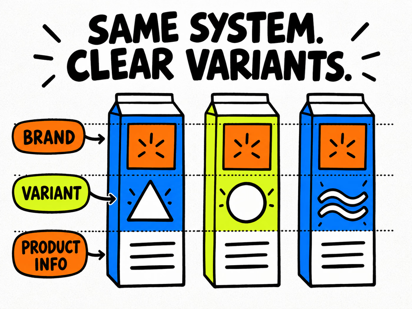
Define stable positions for the original brand, the variant identifier and approved product information. Keep those roles consistent across the range while allowing each carton’s actual dimensions and content to differ. Consistency is a relationship between layouts, not a requirement that every box be identical.
The illustrated fronts below share an original identity area, use different geometric variant markers and reserve a separate information zone. The marks are conceptual. They are not ingredients, product claims or regulatory wording.
| Zone | Keep consistent | Change by approved item |
|---|---|---|
| Brand | Original identity and visual priority | Format-specific placement adjustments |
| Variant | Readable identification method | Actual product or variant name |
| Product information | Clear information hierarchy | Approved content for that item |
| Artwork record | Traceable file naming | SKU and revision reference |
Check the smallest item first
Review essential text at the actual proposed printed size, especially on the narrowest carton. Do not solve a crowded layout by shrinking all the information together. Establish the required content, then discuss the available faces and hierarchy with the appropriate teams.
Use the typography guide for readability and the color-consistency guide for appearance across components. A screen family can look unified while real substrates and print processes produce differences that still need review.
Prepare your own exterior packaging brief
Create a specification line for each item: actual container reference, complete packed dimensions, intended use, proposed carton construction, artwork version and quantity. Keep required product-information approval with the files rather than asking the printer to invent missing copy.
If a label is part of the proposed system, identify its exact application surface and conditions. The fact that the same graphic appears on a carton does not establish that one label material works on every bottle or tube.
Make the next revision traceable
Explore labels with the actual application brief, and follow the artwork guide for file preparation. Request the correct template for the agreed structure and review output against the supplied instructions. Save source files, proofs and approvals by item.
Keep SKU quantities separate and record changes to the container or content. A new closure, different accessories or revised information may affect more than the carton artwork. Review the actual change against its scope so the next order remains connected to the defined product.