
Coffee Loyalty Card Design: Clear Layouts for Independent Cafés
Define the café’s reward rules before arranging stamp spaces. Plan readable conditions, distinct campaign versions, and a real stamp-and-finish test.
A useful coffee loyalty card design starts with approved reward rules, then gives staff and customers clear stamp spaces, readable conditions, and an identifiable campaign version. Decide what qualifies and how redemption works before laying out the card. Test your chosen stamp and ink on the actual proposed finish; a neat screen layout does not show how it will mark in service.
A loyalty card is a small working tool. Staff needs to mark it quickly, and the customer needs to understand it without asking someone to interpret the artwork.
Define the reward rules before the design
Write the proposed program in plain language first. What earns a mark? What does a completed card qualify for? Who can redeem it, and how does staff recognize an already redeemed card? Those decisions belong to the café, not the designer’s decorative copy.
Keep eligibility, any exclusions, dates, and redemption steps in one approved text record. If a rule is still undecided, resolve it before the file is prepared for printing. Do not allow an attractive “free coffee” line to become an accidental offer.
Walk through a few orders
Ask staff to explain what would happen for an ordinary qualifying order, an excluded item, and a redemption. If people give different answers, the rules need work before the layout does. Record the agreed wording and the campaign version.
The illustrated cards use empty spaces and planning labels. Their space count is a layout example, not a recommended reward threshold or a live café promotion. This guide makes no claim about increased visits or sales.
Compare stamp-card layout options
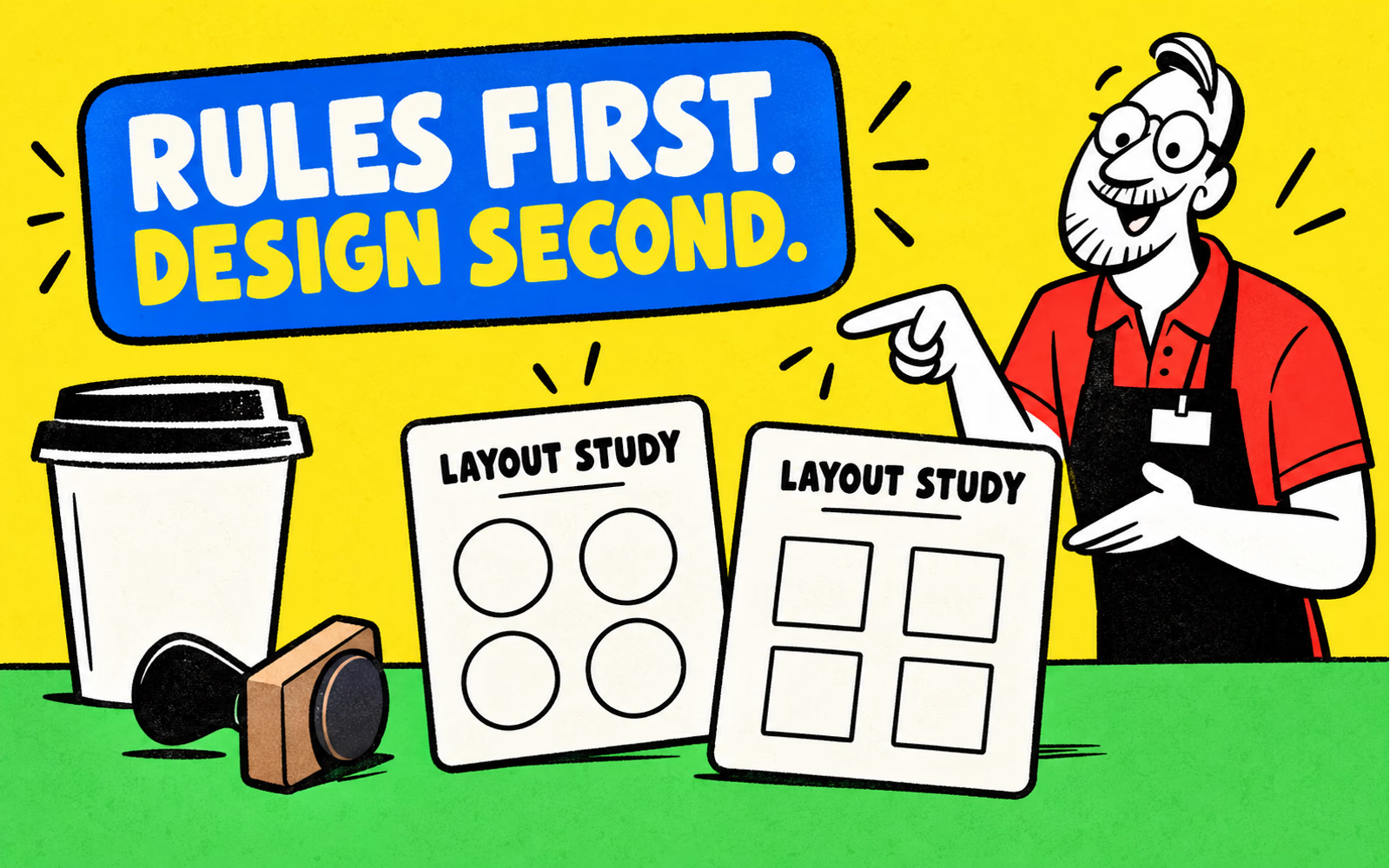
Try two arrangements on plain paper. One can place a short row of marks on the front; another can separate the mark area from the campaign identity more strongly. Use the same approved text for both so you are comparing layout rather than changing the program.
| Element | Planning question | Paper check |
|---|---|---|
| Stamp spaces | Can staff reach the next space clearly? | Place the actual tool over each candidate space |
| Campaign identity | Can this version be distinguished from an old one? | Compare the printed version identifiers |
| Conditions | Can the essential wording be read comfortably? | Review the card at intended finished size |
| Redemption step | Does staff know what to do with a completed card? | Walk through the agreed process |
Keep stamp areas clear of detailed backgrounds. Leave enough separation for the actual mark your tool makes, then check the arrangement with that tool. A circle on screen is not evidence that a particular stamp will fit or remain readable.
Keep the visual identity simple
Use one recognizable café identifier and a small number of colors. The card needs to work alongside the cup and counter materials, but repeating a logo in every stamp space can make the marked state harder to read.
Keep conditions and contact details readable
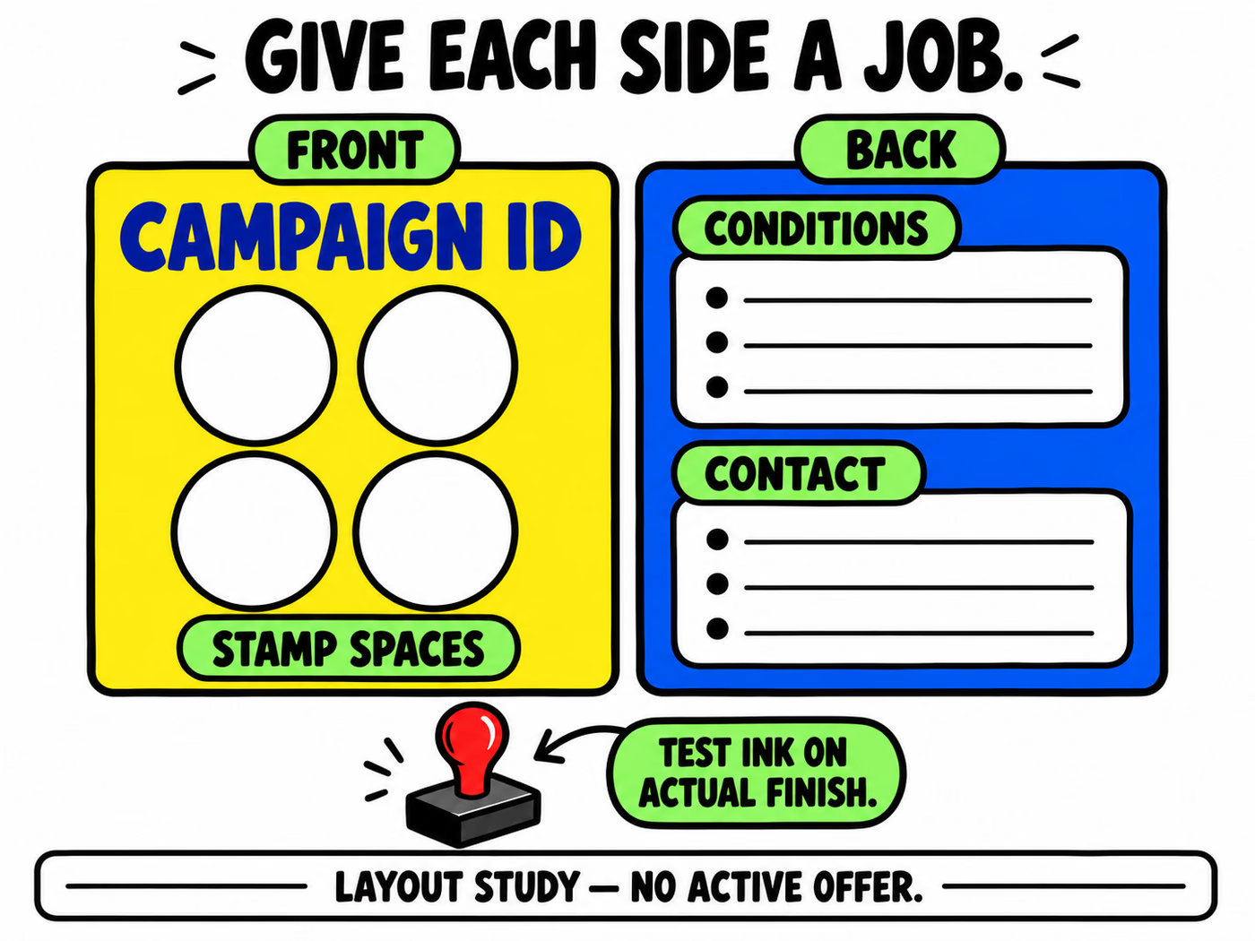
Give the front and back different jobs. The front can carry the campaign identity and marking area. The back can hold the approved conditions and a relevant contact detail. Place the information a customer needs to interpret the card where it can be found easily.
Print the proposed layout at actual size and read it under ordinary counter lighting. Check the essential conditions first. If they are too small, simplify the surrounding design or reconsider the card format instead of shrinking the rules further.
Verify the final copy
Proofread campaign names, dates if used, contact details, and the redemption wording against the approved record. A decorative website address should be an actual current destination. If you include a code, use a real tested asset and follow the QR placement guide; the examples here include none.
Use the printed-size typography check and card-file preparation guide for the layout review. The infographic separates the content areas without supplying operational reward terms.
Specify the printed card and test the stamp area
Ask whether the proposed card construction and finish can be quoted for your marking workflow. Provide the finished size, artwork on both sides, desired finish, stamp tool, ink, and quantities by campaign version. Do not assume that a paper name guarantees stamp performance.
Review the actual printed sample with the actual stamp and ink. Observe mark clarity, drying behavior, handling, and whether repeated marks remain distinguishable. Record the result before approving a production specification.
Keep campaign versions separate
Name the approved artwork and retain the matching rule text. When a promotion changes, update the file identifier and decide how old cards will be handled before replacing them at the counter. This prevents an outdated design from circulating with new staff instructions.
Coordinate a separate thank-you message with thank-you cards only when it serves a distinct purpose. Prepare production artwork on the confirmed template and request quantities and timing for the actual project.