
Starbucks Cup Design: Packaging Lessons for Independent Coffee Shops
Study documented design choices, then write an original cup brief. Keep the main identity, useful information and physical print boundaries working together.
Starbucks cup design offers useful examples of a recognizable identity combined with coordinated seasonal graphics. Its documented November 2025 holiday collection uses apron-inspired ribbons, plaid and related hot and cold designs. For an independent café, the practical lesson is to define a clear visual hierarchy and a repeatable original system, then adapt it to the actual cup’s printable area. Study the principles without copying the Siren, brand marks or distinctive artwork.
A cup can carry a clear identity and still make room for everyday service. The useful question for a small café is how each visual element earns its place on the cup customers actually hold.
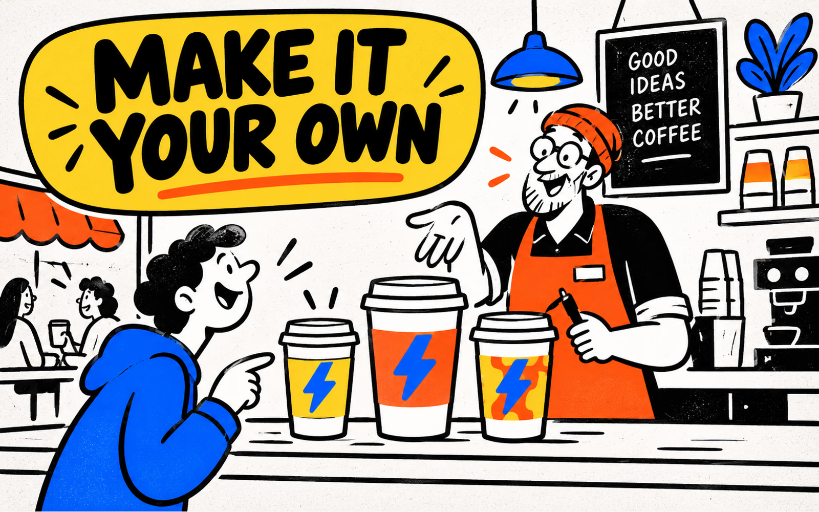
What the documented cup designs show
Starbucks’ November 5, 2025 design story describes a holiday collection with apron-inspired ribbon motifs and plaid variations. Its published images include hot cups and clear cold cups carrying related visual elements. This is a dated example, not a claim about an unreleased 2026 holiday collection.
The source also describes a small message area on the back of the cups. That detail gives the design a specific service-related use alongside its seasonal appearance. The interpretation for an independent café is to assign a purpose to the secondary area instead of filling every space with decoration.
| Documented element | Question for your café | Original response to develop |
|---|---|---|
| Related motifs across formats | What should remain recognizable? | Your own repeatable graphic language |
| Prominent identity in the images | What should viewers notice first? | An original mark with a clear visual priority |
| Message area | Does a service task need space? | A suitable field for your own workflow |
The planning questions are our analysis of the source, not a statement that the collection produced a measured sales or loyalty result. All illustrations here depict an original fictional café identity; they do not reproduce official Starbucks cups.
Logo hierarchy and usable print area
Decide which element should lead: the café name, an original mark or a short message. Give the primary identity enough space to be recognized at ordinary viewing distance, then review secondary information separately. More text does not always make the cup more informative.
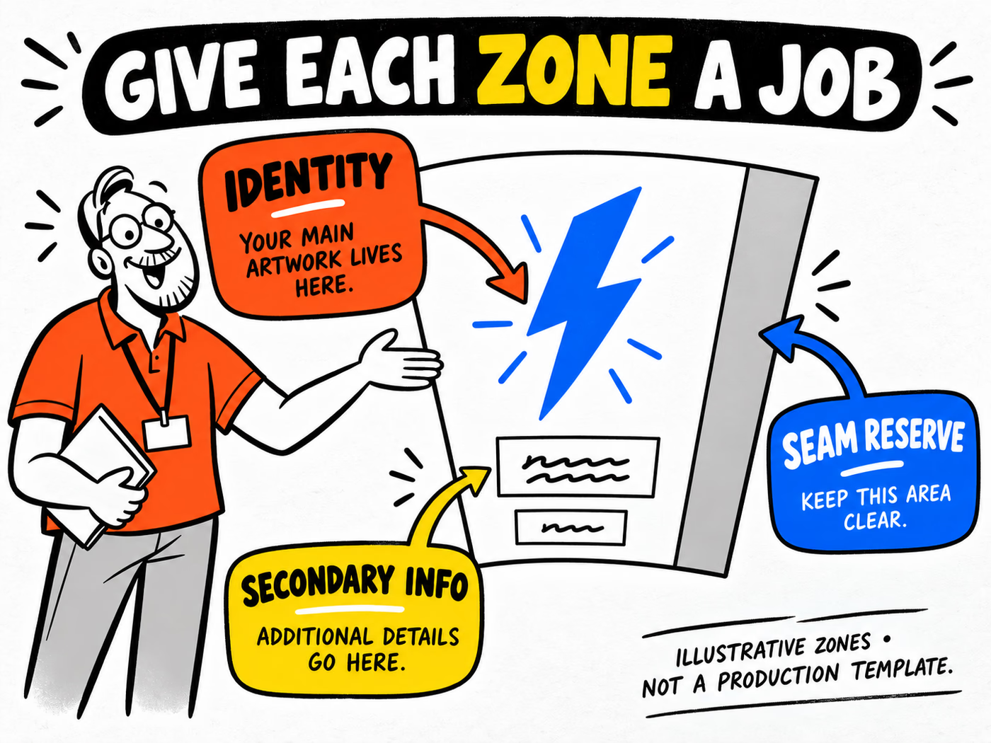
Work with the approved template for the exact cup. A cylindrical or tapered surface changes how a flat layout is seen; seams, reserved areas and handling can interrupt a composition. The concept diagram below names those jobs without supplying production dimensions.
Review the cup as it is held
Place the design on an appropriately described sample or concept and examine more than one angle. Check what a hand or sleeve covers and whether a message wraps out of view. If the logo is the first thing to recognize, avoid making its visibility depend on a very narrow camera angle.
The logo-placement guide focuses on that physical viewing problem. Use it alongside the actual printable-area specification. A reserved seam strip in an illustration is a planning prompt, not the clearance required by your supplier.
Adapt the principles without copying
Build a visual vocabulary from your café’s own identity. Choose an original mark, a purposeful color palette and a small set of graphic elements that can work across cups, sleeves and cards. Define which parts remain stable and which can change for a seasonal message.
The fictional concept in this article uses a blue lightning bolt with yellow and orange fields. It is an illustration of repeatable identity, not a ready-to-print logo package. Develop your own approved artwork and review its suitability for the business before production.
Keep variation controlled
For example, retain the original mark while changing one background motif for a seasonal drink. Compare the ordinary and seasonal designs side by side so staff and customers can still identify the café. Avoid adding borrowed brand symbols just because they are familiar.
Coordinate secondary pieces by role. A sleeve needs to work with the cup it covers; a loyalty card needs readable instructions. The loyalty-card guide helps with useful information, while the color-consistency guide explains why matching screen colors do not establish identical printed results across materials.
Specify an original branded cup
Begin the production brief with intended drink use, requested capacities and the exact proposed cup and closure references. Add sleeve requirements where relevant. Once the format is agreed, request the correct template and prepare each artwork version for that item.
Keep quantity, size and artwork version connected. A seasonal design on one capacity and a standard design on another should be explicit in the order rather than hidden under one total. Save the approved source files and output specification together.
| Brief field | What to provide |
|---|---|
| Drink and capacity | Intended hot or cold use with explicit units |
| Cup, lid and sleeve | Exact proposed references and open questions |
| Artwork versions | Original approved files for each item |
| Quantities | Count by size and design |
| Delivery | ZIP and required project timing |
Explore coffee cups and cup sleeves. Review cup-and-lid compatibility and wall constructions separately. Use the artwork guide to prepare files against the agreed specification. The result should be your café’s own identity on a defined product, with an approval record that can support the next reorder.