
Aesop Packaging: Lessons in Minimalist Retail Presentation
A restrained package can still contain useful information. Study a dated Aesop example, then organize your own labels, cartons and bags by their reading tasks.
Aesop packaging offers a useful example of restrained presentation with structured information, rather than simply empty space. Its Spring 2025 US corporate-gifting brochure shows coordinated product labels and gift cartons; its online-services page separately describes gift preparation with a cotton bag and message card. For your own retail system, group approved information into clear reading levels and define the carton, label and carrying bag as separate components. A plain or kraft appearance does not establish sustainability.
A minimal-looking label may still have a substantial amount to say. The design challenge is to make the reading order clear without deleting useful information or shrinking every line.
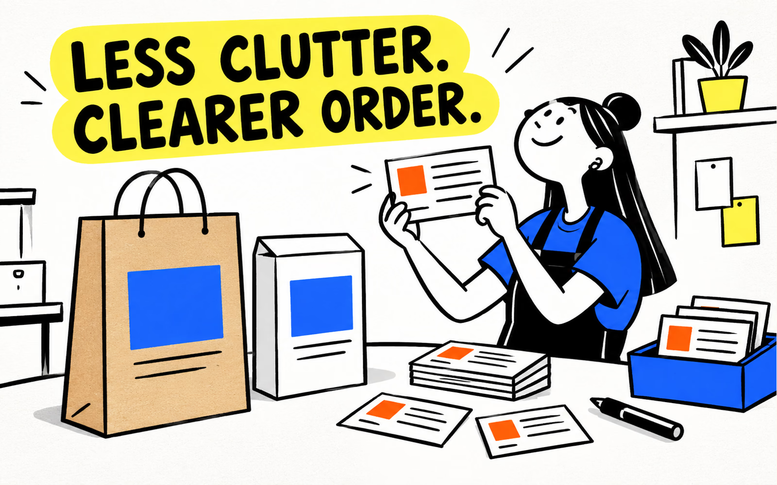
Review documented Aesop packaging
Page 10 of Aesop’s Spring 2025 US brochure shows three named duet sets with bottles and coordinating cartons. In that dated image, product names, brand areas and supporting information appear in distinct blocks. The cartons vary in color while the related layouts remain visible.
Our design interpretation is that grouping makes information roles easier to distinguish. It is not evidence that the packaging improved sales or that its specific materials, containers or finishes can be reproduced by another supplier.
| Reviewed source | What it documents | Question for your own brand |
|---|---|---|
| Spring 2025 US brochure | Related product and gift presentations | Which information roles should stay consistent? |
| Online-services page | Gift preparation with a cotton bag and card | What is the gift layer’s job? |
| Product and carton imagery | Different printed surfaces | Which component needs its own artwork? |
The online-services page describes cotton-bag gift preparation separately. That does not make a cotton bag equivalent to a paper shopping bag. Our illustrations use original blue geometric graphics and no amber bottles or copied Aesop labels.
Balance product information and visual restraint
Make a complete content list before arranging the label. Identify the brand, item or variant name, supporting editorial message and any information your responsible team has approved for the actual product. Group related copy and decide the order in which it should be found.
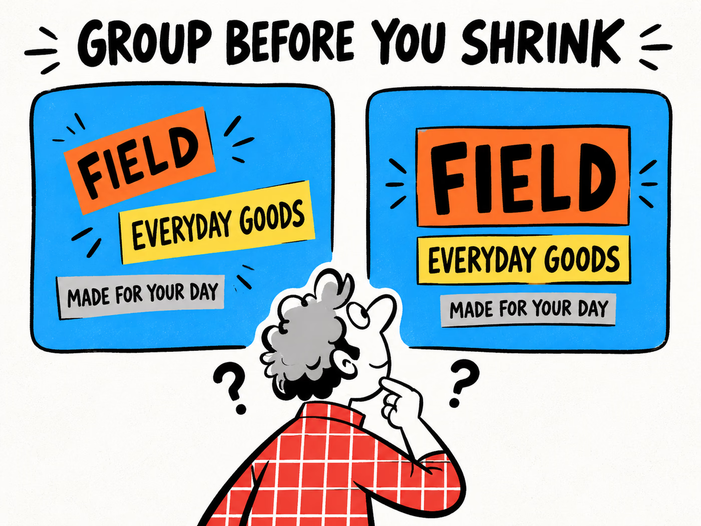
The Field exercise below uses only three fictional editorial phrases: Field, Everyday Goods and Made for your day. Both layouts contain the same copy. The difference is their grouping, alignment and emphasis, not the removal of required information.
| Block | Editorial example | Layout question |
|---|---|---|
| Identity | FIELD | Can the reader locate the name first? |
| Category | EVERYDAY GOODS | Does the next level support the identity? |
| Message | MADE FOR YOUR DAY | Is this secondary line clearly separate? |
Reduce competition before reducing size
A crowded layout often needs fewer competing signals: several fonts, repeated bold lines or decorative marks all asking for attention. Review those choices, line breaks and spacing before making every word smaller. Keep the complete approved copy available during the review.
Use the typography guide to inspect the proposed label at finished size. The fictional example supplies no ingredient text, cosmetic instructions or legal wording. Required content for a real product remains a separate approval input.
Coordinate cartons, labels, and bags
Choose common visual roles across the set: an original identity area, a method for distinguishing variants and a consistent relationship between headings and supporting copy. Then adapt those roles to each piece’s available space and viewing conditions.
A label may be read on a curved surface. A carton has faces and folds. A bag is often seen during carrying. A shared identity does not require those pieces to use identical layouts or the same physical material.
Keep component boundaries visible
The Rhode guide explains the difference between a primary container and its exterior carton. Apply that boundary here: the label brief needs an actual application surface, while a carton brief needs the packed item it surrounds. Neither defines the product’s formula or container requirements.
For labels, provide the surface, application and handling conditions. For folding cartons, confirm the proposed structure and packed dimensions. For paper bags, identify the complete carrying arrangement.
Check printed appearance with the color-consistency guide. The same screen color can look different on separate substrates. Record actual references and reviewed samples rather than treating the digital set as a completed print match.
Create a distinct retail packaging brief
Write your own visual rules in plain language: what leads the layout, which information is grouped and how a variant changes. Keep the original artwork distinct from Aesop’s identity. The useful outcome is a repeatable system for your products, not an imitation of another brand’s label.
Prepare a component list with actual dimensions, intended use, confirmed construction, application conditions, artwork revisions and quantities. State whether a bag is for carrying or gift presentation, and identify the packed arrangement it needs to accommodate.
Use material descriptions as specifications
Describe the proposed substrate and finish from confirmed information. A plain, uncoated or kraft-looking surface does not prove recycled content, recyclability or a lower impact. Keep any supported material claim separate from the visual direction.
Review the bag and handle guide and packed-dimension method. Prepare files with the artwork guide. Retain the approved content and sample references for each component so the next order can preserve the system deliberately.