
Dutch Bros Cup Design: Lessons for a Recognizable Coffee Brand
Study a documented cup collection, then separate your café’s permanent identity, drink information and temporary graphics across the formats you actually use.
Dutch Bros cup design is useful to study as a coordinated collection rather than a single cup graphic. Its official November 2024 holiday story documents six seasonal designs sharing a red, white and green direction while varying their motifs. For your own café, separate the permanent identity, drink information and temporary campaign artwork across hot cups, cold cups and sleeves. This is a design-planning lesson, not evidence that a graphic caused sales or loyalty.
A café’s cup range can change during the year while still feeling connected. The useful decision is what stays fixed, what changes for the drink and what changes only for a campaign.
Review documented Dutch Bros packaging
The November 2, 2024 official story describes a holiday cup collection with music-inspired graphics, bold patterns and seasonal motifs. Its published image shows different designs related by a common color direction. Keep the date attached to the example rather than treating it as today’s full packaging range.
The useful observation is that variation can belong to one visual system. The collection does not need every surface to repeat the same complete picture. It can retain selected visual relationships while changing the individual motif.
| Documented feature | Question for an independent café | Keep separate |
|---|---|---|
| Related seasonal colors | Which colors connect your range? | Claims about measured recognition |
| Different motifs in one collection | What can vary without losing coherence? | Copying another brand’s artwork |
| Multiple cup designs | How will files and stock be identified? | Assumptions about production specifications |
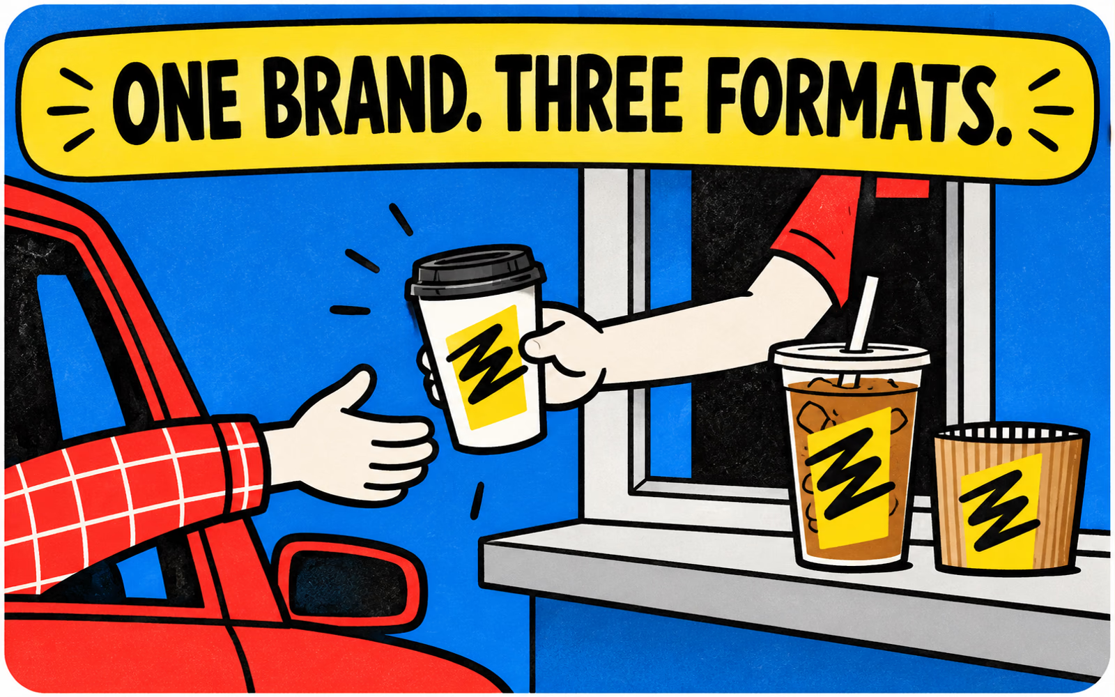
Our illustrations use an original geometric identity in a fictional handoff. They do not reproduce the Dutch Bros windmill or official artwork. The analysis concerns coordination, while the supplier’s exact cup and print specifications need their own review.
Keep a visual system across cup formats
List the actual surfaces your café uses: a hot paper cup, a clear cold cup and a sleeve, for example. Give each surface its own template and purpose. A repeated mark can connect them, but one flat layout should not be copied unchanged onto every item.
A clear cup has a changing drink background; a sleeve covers part of the hot cup; a seam or normal hand position can interrupt artwork. Review the identity on each proposed component and through normal viewing angles before approving the family.
Define the shared elements first
Write down the original mark, approved color references and typographic roles that connect the range. Then identify the adjustments each format needs. Keep small service information readable instead of shrinking the entire layout just to make it fit.
Use the logo-placement guide for the viewing and grip review. The clear-cup branding guide adds the background question. Those physical checks support the system rather than replacing the need for approved production artwork.
Separate permanent branding from campaigns
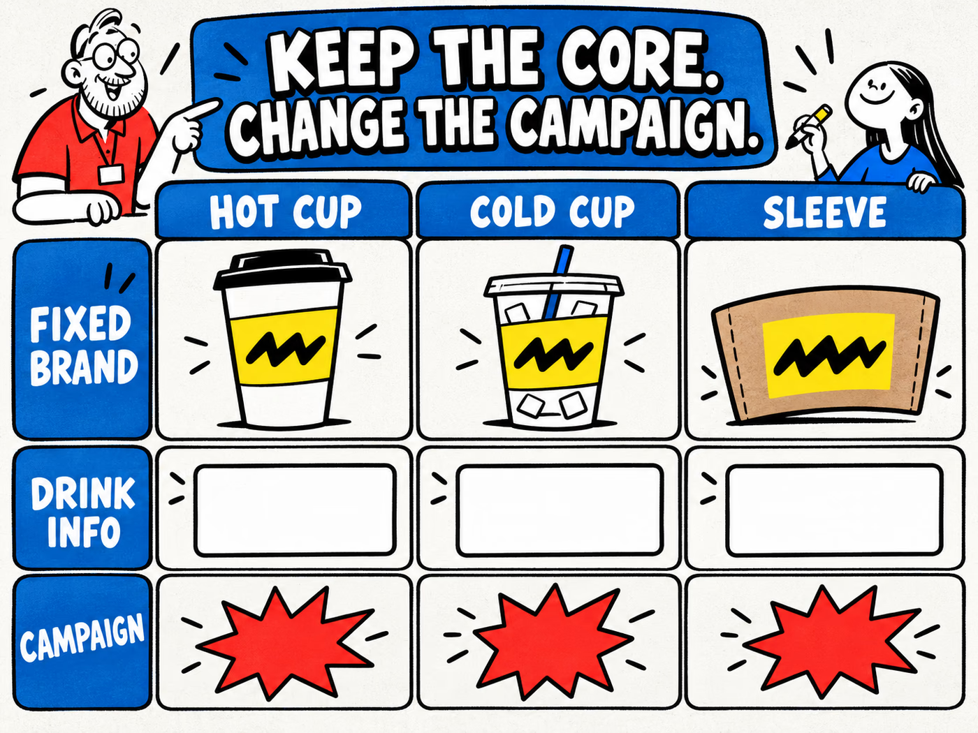
Keep three jobs visible in the file and order record. Permanent branding identifies the café. Drink information helps explain a specific serving or operational field. Campaign artwork belongs to a particular message or period. Decide which job each element performs before introducing a new version.
The matrix below is a conceptual planning tool. Its shared geometric marks represent fixed identity; blank fields represent information to define; graphic modules represent possible campaign variation. It does not activate an offer or establish a printable template.
| Layer | Typical planning content | Version question |
|---|---|---|
| Permanent identity | Original café mark and stable graphic roles | Which approved master stays current? |
| Drink information | Fields needed for the serving | Who approves the changing content? |
| Campaign | A separately approved temporary message | When should this version stop being used? |
Make mixed stock easy to identify
Record campaign and standard quantities separately by cup size. Name files so staff can distinguish the intended item and version without opening every preview. Keep the approved proof connected to the same reference used in purchasing.
A seasonal card can change independently from a cup if that better fits your workflow. The loyalty-card guide explains why a useful campaign piece also needs clear rules and a traceable version, not just coordinated colors.
Plan your own coordinated drink packaging
Begin with the drinks and requested capacities, then confirm exact proposed cup, lid and sleeve references. Use the Dutch Bros size examples only as a menu comparison; they do not identify a product you can order from another supplier.
Request the correct template for each agreed item and prepare the original design against its printable area. Keep artwork versions, quantities by item and delivery ZIP in one brief. Record unresolved fit or print questions before approval.
Approve the family and the individual items
View the proposed range together to review consistency, then review each actual component for its own job. Matching colors in a screen preview do not establish identical print appearance across paper, plastic and a sleeve. Save the specification and approval record with the artwork.
Explore coffee cups, plastic cups and cup sleeves. Use the cup-and-lid guide and wall-construction comparison for their separate decisions. A coordinated design should support a clearly defined serving setup.