
Matte vs. Glossy Packaging: Check Appearance, Readability, and Handling
Compare the same artwork on the actual proposed surface. Review light, small text and ordinary handling before choosing a finish for your project.
Matte vs. glossy packaging is a comparison of the complete printed surface, not just two finish names. Identify the substrate, print process and proposed finish, then review the same artwork under relevant lighting and ordinary handling. Look at reflections, essential text and surface marks on actual samples. Gloss does not establish waterproofing, and a matte appearance does not prove scratch resistance or recyclability.
A finish can look convincing in a close-up and behave differently when the pack is turned in someone’s hand. Keep the comparison tied to the way the customer will see, read and handle the actual package.
Identify the finish and substrate being compared
Ask what each finish description means in the proposed specification. Record the base material, printed side, printing process and any applied surface treatment. A label and a carton are different components; two samples called matte may not have the same construction.
Give each sample a reference connected to the supplier’s description. If the comparison also changes the substrate or printing method, record those differences rather than attributing everything you see to gloss level.
| Input | What to retain | Why it matters |
|---|---|---|
| Base surface | Material and component reference | Keeps different substrates visible |
| Artwork | Same file and version | Prevents design changes confusing the review |
| Finish | Supplier’s actual specification | Goes beyond a visual name |
| Sample | Reference and represented construction | Defines what the review can support |
The kraft-versus-white guide considers the print surface itself. This article adds the finish review. A brown base, a shiny face or a soft-looking illustration cannot establish the material’s composition or performance.
Check the same artwork under different light
Use the same design at the same intended size on both proposed surfaces. Include the actual small text, dark areas and brand graphics that matter to the project. A comparison between a plain white matte sample and a colorful glossy sample mixes too many variables.
Start with an agreed viewing position and light, then turn both samples in the same way. Note where a reflection crosses the product name or where a dark area becomes difficult to judge. Repeat the observation in a relevant setting, such as the counter or shelf where the pack will be seen.
Keep the observation conditions with the result
Write down the light source, viewing position and sample references. A short note such as “product name obscured at this angle” is more useful than a general rating of premium. If a photograph records the comparison, keep camera and light settings comparable and retain the unedited originals.
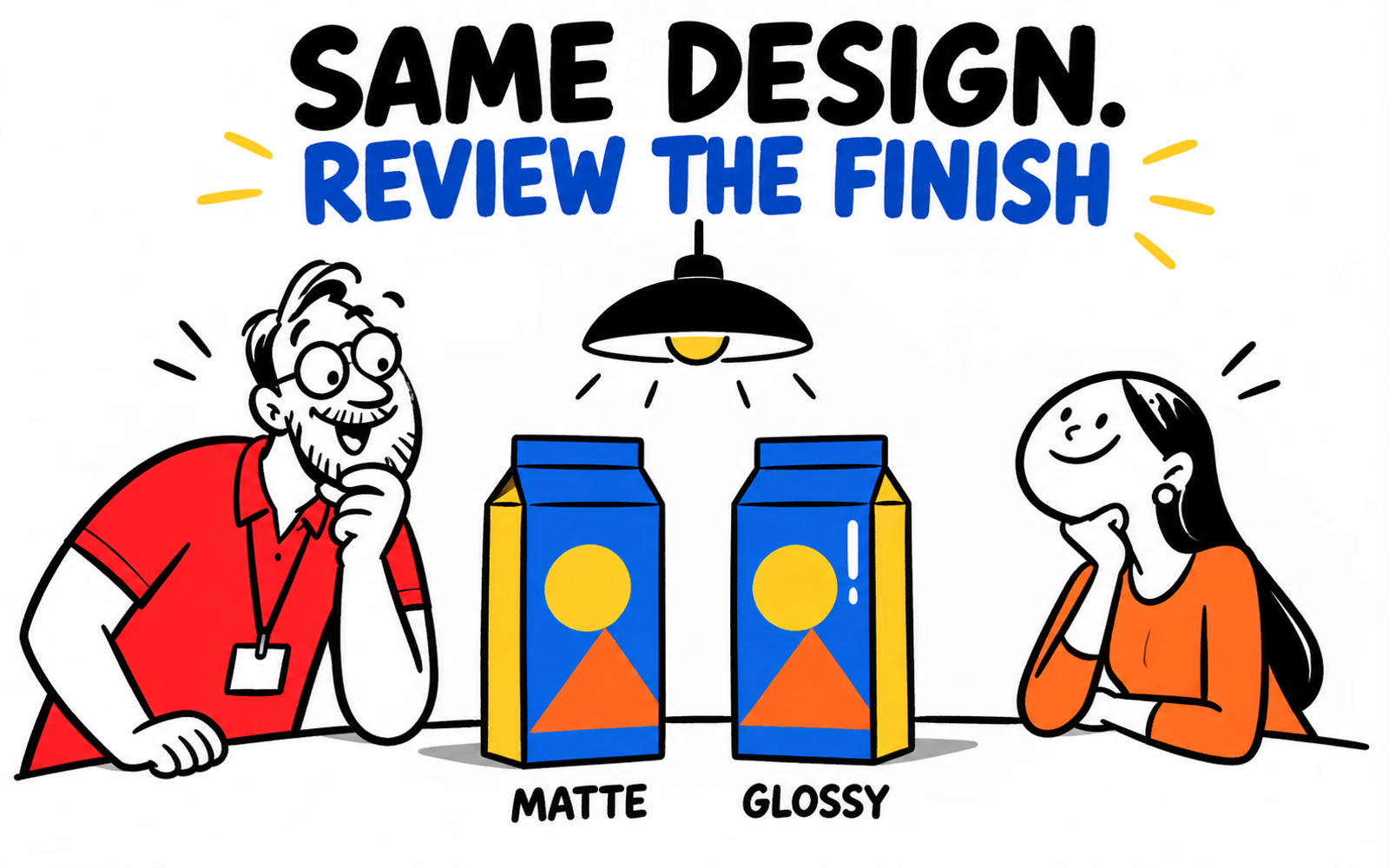
Our illustration uses one lamp and a modest highlight to explain the idea. It does not demonstrate the reflective behavior of a manufactured finish. The photography guide explains how to show useful views without hiding the characteristics of the real sample.
Review readability and handling with a sample
Read the actual product identifier, instructions and other essential words at the intended printed size. Turn the sample as a customer would and check whether the information remains easy to find. Review required text separately with the responsible product team; this design exercise does not set a universal type-size rule.
Then examine the sample after the relevant handling steps. Record what was done and what appeared: visible fingerprints, rubbing marks or a change around a fold. Do not turn an informal observation into a durability claim without an agreed test method and results.
Leave room for actual observations
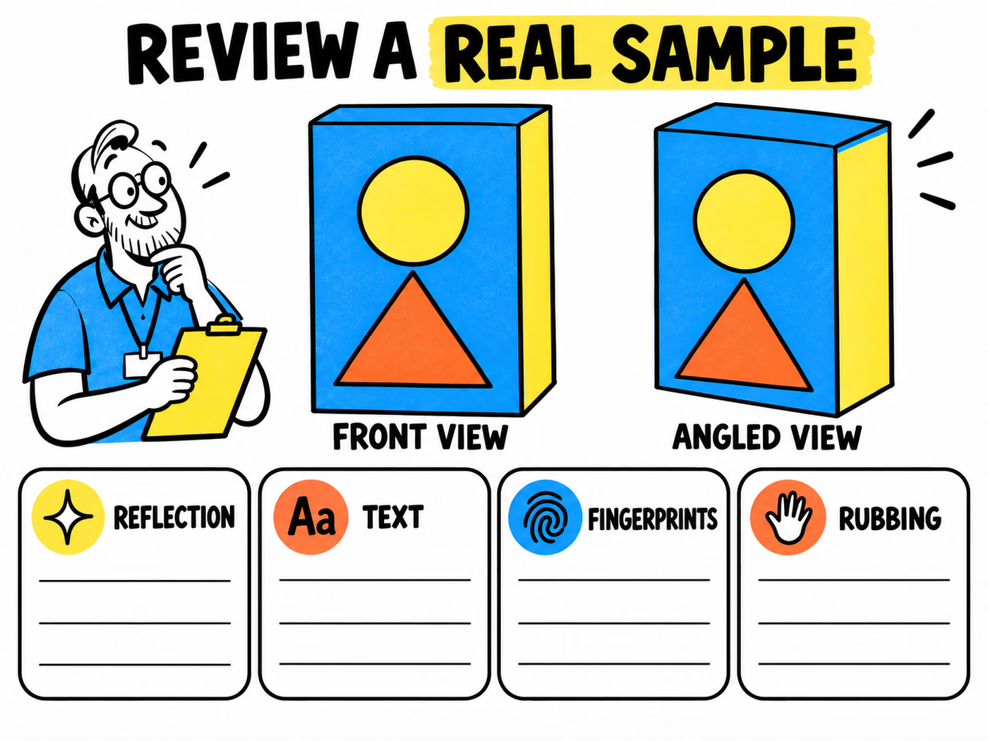
The worksheet below keeps front and angled views together with four blank observation fields. Use those fields for what the real sample shows, including “not reviewed” where appropriate. Avoid ticks that suggest a finish has passed an undefined test.
Compare the typography guide for an actual-size reading review and the mockup-versus-prototype guide for the scope of sample evidence. A digital finish rendering is useful for discussion but cannot replace the physical observations.
Confirm which finishes are available for your product
Present the preferred appearance together with the actual use and the observations that led to it. Ask which finishes are feasible for the selected construction and order. Identify an optional treatment as a request to discuss, rather than assuming that every product can receive the same finish.
Explore labels, product boxes and folding cartons with component-specific briefs. List finished size, artwork versions, quantities and delivery ZIP. Keep any moisture, contact or resistance requirement explicit instead of using “glossy” as a substitute.
Retain the reviewed reference
Follow the artwork guide for the approved structure and review the proposed finish with production. Retain the sample reference and agreed scope beside the final artwork so a later reorder does not rely on a vague visual description.
If several components share the same identity, use the color-consistency guide to coordinate their appearance. The goal is a clear, reviewed relationship across the collection, with each material and finish identified.